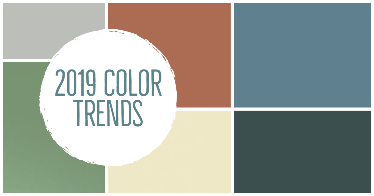
I love reviewing all the colors that paint companies choose for the upcoming New Year. Let’s dive right in and see what 2019 will offer!
Behr – Blueprint S470-5
 On their website they describe it as an “approachable color that conjures up the blueprints builders rely on to bring architectural designs to life, Blueprint creates a space where you can build your own reimagined life…” seems a bit lofty for a paint color, doesn’t it? I see this blue as a good accent color in accessories, furniture, etc.
Sherwin-Williams Cavern Clay SW 7701
 Is a brownish hue, when I saw it I thought terracotta and southwest and is a color you have seen in the fashion industry as they revive all the looks of the 70s, it pairs well with earth tones, browns, indigo blue, and white accents.
The director of color marketing Sue Wadden stated, “We believe 2019 will be a renaissance of the 1970s—with a twist. In the coming year, we will embrace our pioneering spirits and artisan ingenuity. Our 2019 Color of the Year, Cavern Clay, embodies renewal, simplicity and free-spirited, bohemian flair.â€
PPG Paints PPG1145-7 Night Watch
 This color is described as a dark green however it has a lot of blue in it and is part of their Aquas color family. I see this color working best as an accent color in furniture and accessories. The senior color marketing manager, Dee Schlotter stated that this color “is about bringing the healing power from the outdoors into your home through color. The dark green hue pulls our memories of natural environments …”
Dutch Boy Garden Patch 326-5DB
 Described on their website as “not too deep and not too primary, this nostalgic, botanical hue stands out for its warm and calming effect. Paired with soft neutral and pops of warm colors…offers rejuvenation and peace at the end of the day in every room of the home.”
Clark+Kensington Color – Pineapple Cream Granita
 Ace Hardware turned the color of the year selection into a contest. They chose a winner, who said: “When I created this color, I was daydreaming about enjoying a delicious dessert while on a relaxing vacation in Sicily with my daughter,†said winner Francine C. It’s a pale yellow that could be used as a background color in any room, if you like a creamy yellow.
Valspar
They decided one color a year wasn’t enough, and chose 12 to keep us changing colors from month-to-month. I think it’s an ingenious idea to encourage people to invite color into their life and update decorating elements over the year. Too often homeowners set up their home and don’t change a thing, which is when it looks stale, and they become unhappy with their home. Change is good, and I encourage you to embrace color into your lives!
12 colors from Valspar:
Benjamin Moore’s Metropolitan AF-690
 A shade of gray with cool undertones described as “calm, composed and effortlessly sophisticated” on their website. Benjamin Moore offers a coordinating palette to pair with this color, click here to view.
Pantone usually releases their color of the year in December, remember the 2018 color is a vibrant purple, UltraViolet. I wonder what they will choose for next year. I set up a Pinterest board for you to review the colors and get ideas, click here to view.
If you need help integrating colors into your home and unsure where  to start, I can help save you time and money on paint and decorating items that you are unhappy with, contact me 610.955.8202 or email to set up a consultation!
By Debbie Correale, founder and owner of Redesign Right, LLC. You can learn more about her at RedesignRight.com. Find her on Facebook.com/RedesignRight, Twitter @RedesignRight, LinkedIn, Pinterest, Houzz, Google+ and Instagram.
